Final Assignment Upload
For this final project, I unfortunately wasn’t able to get the game as polished as I would’ve liked, but it was taking me a while to learn some of the concepts, and I had some struggles with the coding, but I did the best I could with the time I had.
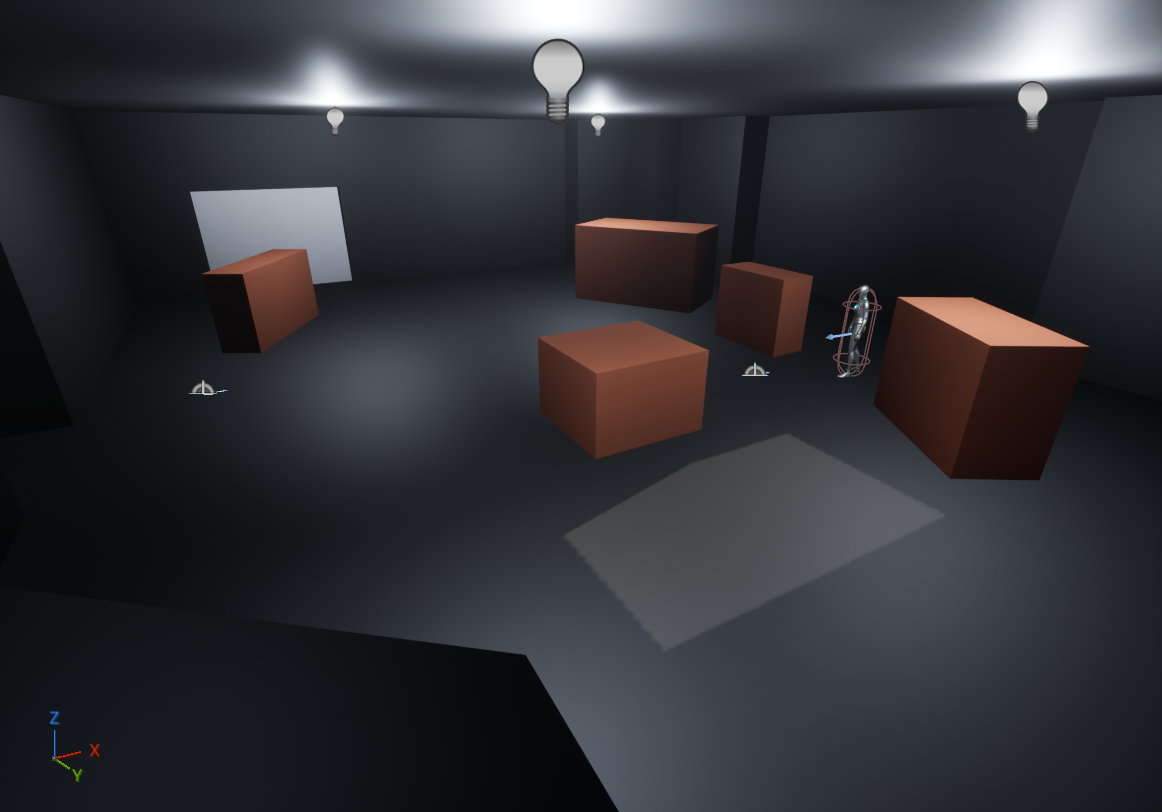
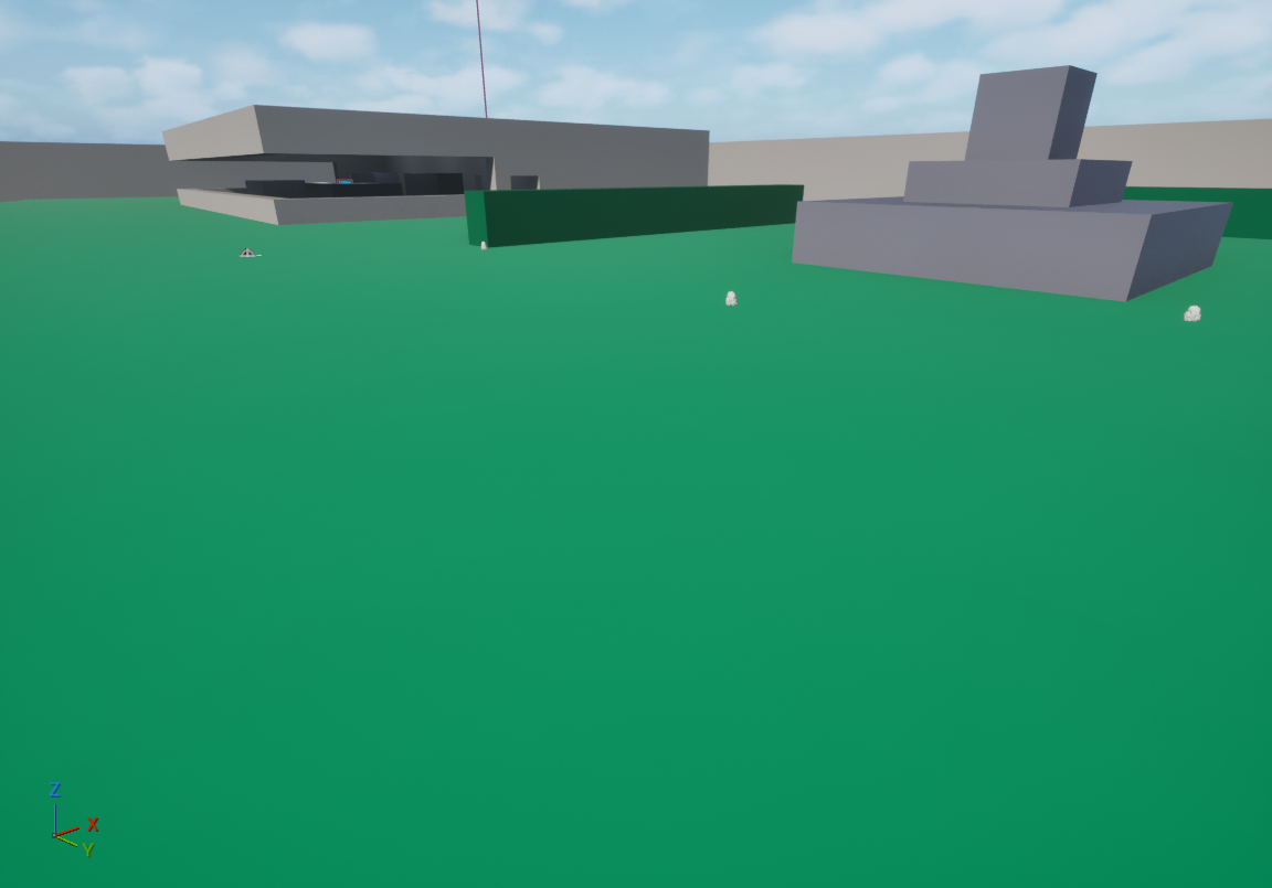
To start I’ll go over the lighting in the game. I went pretty simple and still couldn’t quite get the lighting to achieve the effect I was going for, this is a big part I’m still learning. My main focus was on readability and visibility in most sections of the map. I wanted shadows to be minimal so that the layout of the terrain and objects was clear, making potential hiding spots and routes clear to the player. Included here is an image of the main open area of the ship, where I removed shadows to allow the areas around the boxes and on the floor to be more visible allowing for the player to more clearly see where they are at, where enemies are, and where they can go.
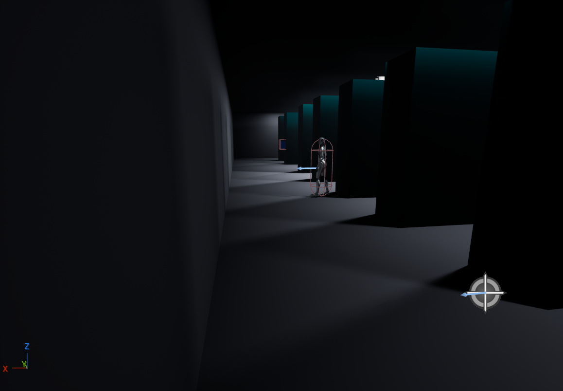
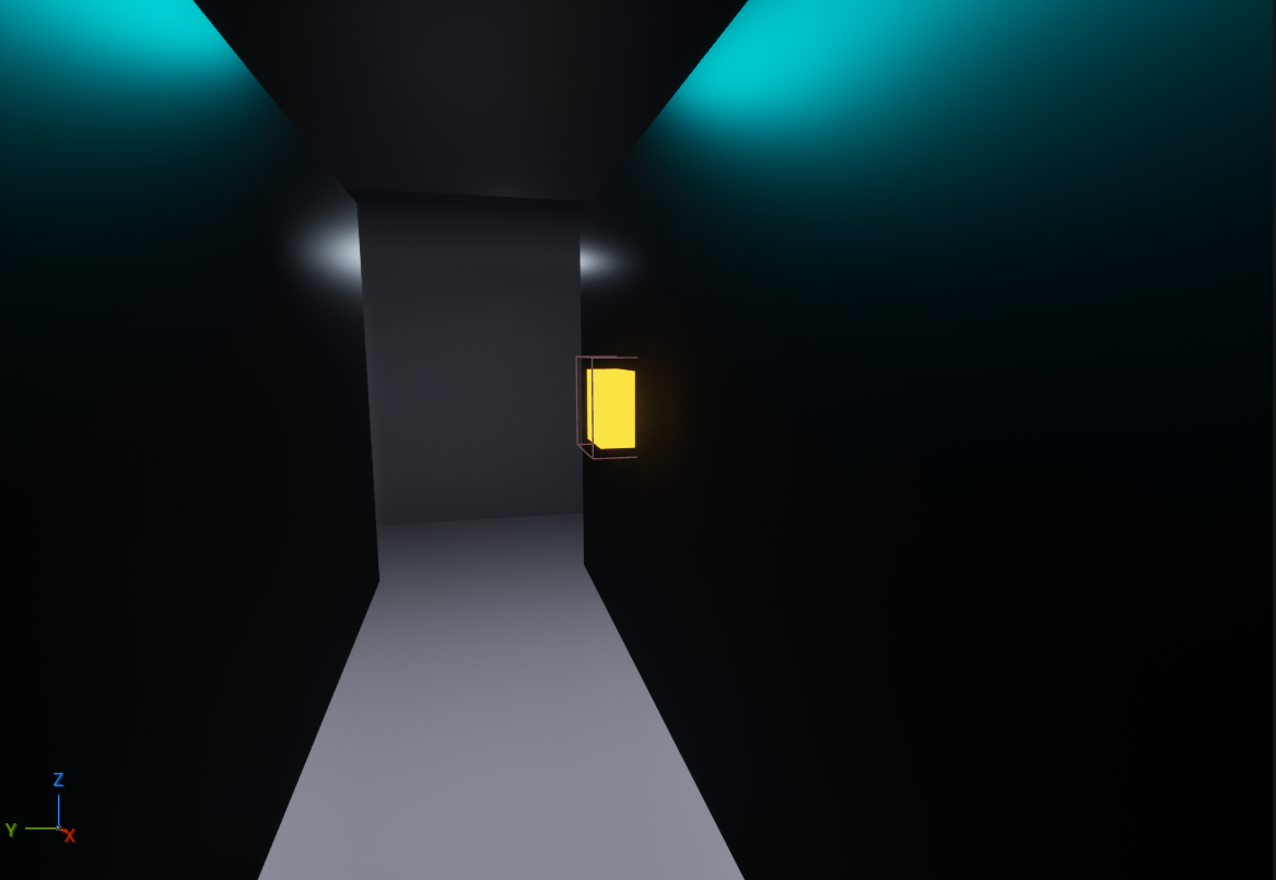
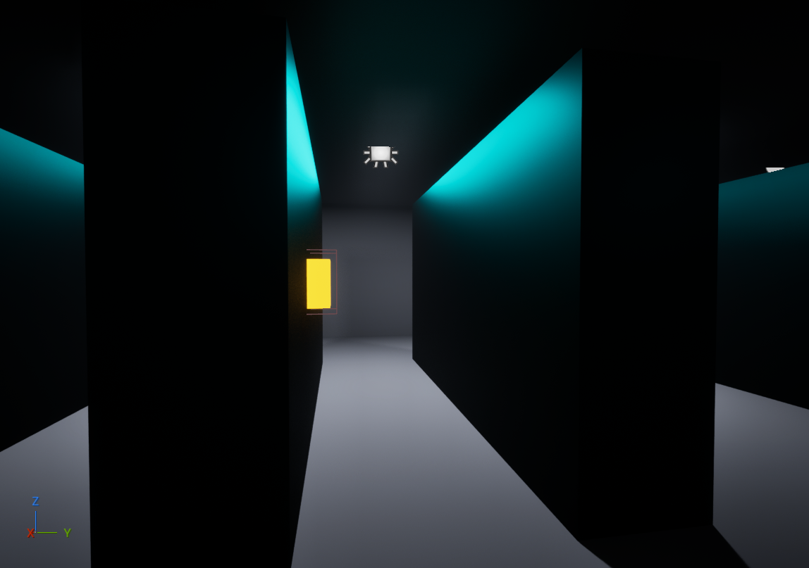
I played around with brightness a little, but not as much, mainly to give the world an overall consistent look and to emphasize some important areas. One example of this is in the back of the security office is a server room, and there's a button to be pressed in there, I tried having the lights get progressively brighter around it to lead the player toward the spot and find the button.
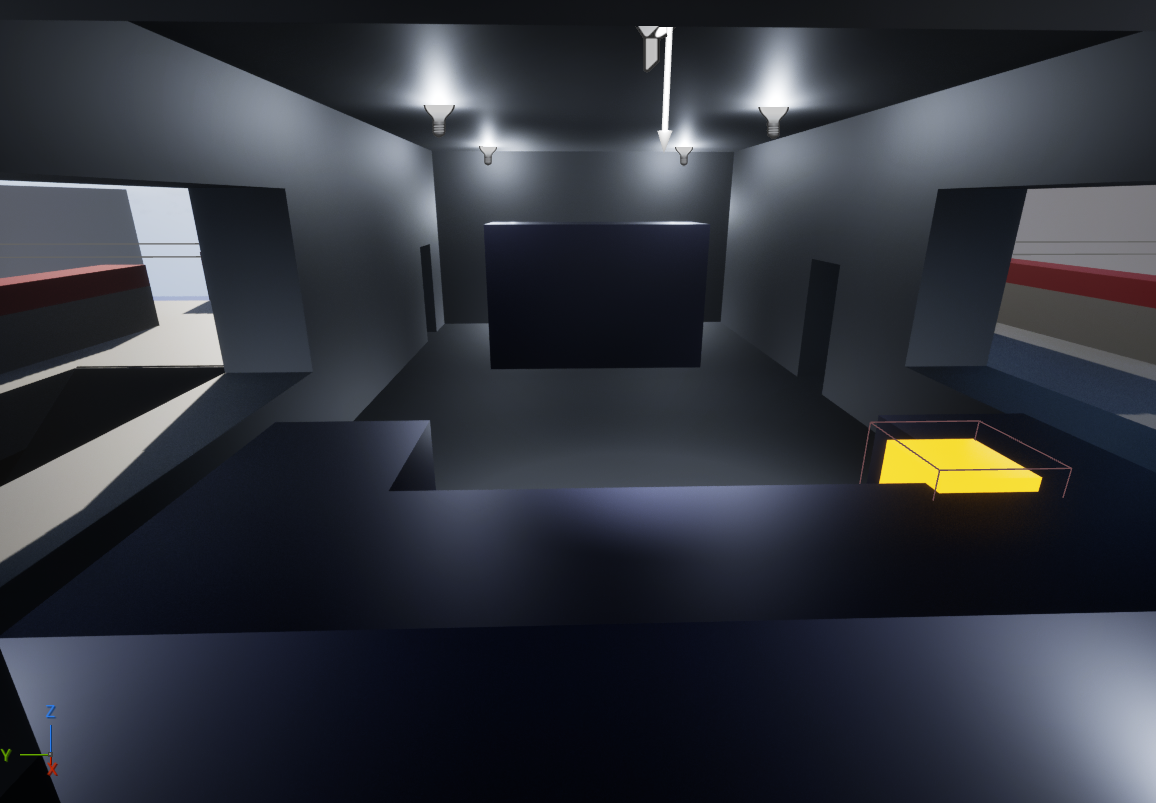
I also tried giving the button a bright, emissive color to further draw the players attention.
Finally, as these images have shown, all of my lighting is basically plain white. This stems from the overall feel I want the level to have. Overall this place has the look of a military compound or something similar, and so I felt that to match that tone the lighting needed to be very neutral and kinda industrial, this leads to how I did the post processing on the level.
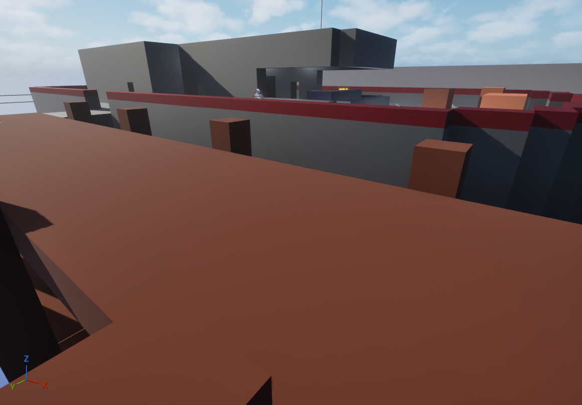
Overall I went pretty simple with the post processing too, messing with exposure and other values to increase visibility across the board. I didn’t like the idea of adding much else beyond a simple vignette when crouching (I still need to figure out how to properly implement the crouching animation). There is one big change I made though, and this will come up in the materials again too. I overall made the world look colder by lowering the temperature in the post processing box around the map. POST PROCESSING 1
This continued to push the industrial/military atmosphere of the entire map, helping the map feel cold and emotionless in itself. I did keep the outside areas relatively bright, originally I was working on making the mission take place at night, but I felt that for the type of map this was the player needed to be able to see at a distance, and while this could be accomplished with a night map, it was best suited for the day. I do believe I overall did lower the brightness of things from where they originally were, but not enough to make it impossible to see in the shadows, simply to again push the atmosphere of the level while allowing for clear visibility.
This brings me to the materials. I spent some time looking through materials for something that would fit this map, but was struggling, and I didn’t have nearly the time at my skill level to make lots of materials on my own for the map I had created. I wanted to go with a simplistic art style for a couple of reasons. One is more practical, the computer I am doing this on a not too powerful of a computer, so I had to take hardware limitations into consideration and don’t have the technical know-how in unreal to make more complicated art and lighting run smoothly. The other being that I felt too complex of graphics would risk muddying up the readability of the level with my current level of skill in development. So when I couldn’t find anything particularly simple or stylized I decided to work with simple colors.
Most of the colors are pretty simple, just making it what color the object would be. The main thing I played with was whether something was metal or not and its roughness, overall working on what materials had a “shine” to them. Certain things like the ship’s body, and control panels were metal with a fairly high roughness
This helped sell the look of being metal, but not something super polished. Whereas in the back of the security office the servers are metal, but with much greater reflectivity, helping them look more like, well, what they are, giving them a bit more reflectivity and shine, like high tech computer parts.
I also wanted to give the materials around the map a more muted and colder color to them. So this came in the form of things like the grass being less saturated and having a bit more blue in it, or the docks and red on the ship being less saturated and a little darker in color.
This helped again build the military, unfeeling, almost dangerous atmosphere of the level.
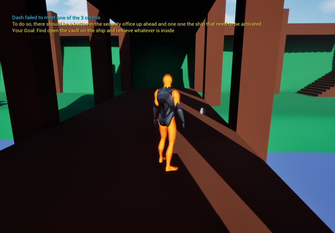
In terms of UI there wasn’t really much for me to do, I didn’t get around to adding a main menu, and the pause menu is still that of the old menu given in the project and will reset the level, this is partially due to me not knowing how to make the functionality better for these. But there wasn’t really any need for an in-game UI besides the messages in the upper left (I don’t remember what that section is called. I did use various text colors to try to increase readability and hopefully drawing the players attention to more important messages, Here’s one example of such. Its starter text to give the player directions as they enter the level, using a bright yellow and staying on the screen longer to draw the players eyes as it differentiates itself from the typical blue most text uses and giving the player time to read it.
I also didn’t find room for VFX in the game, the attacking of enemies was simple and didn’t really need anything to emphasize it. There wasn’t really anything in the world to add VFX to. Maybe I could’ve gone for more with the buttons, but I felt from the colors of them to the text when pressed that there wasn’t more to do.
Unfortunately I didn’t have time to explore audio as I was spending longer than anticipated on lighting and other parts of the level. I also don’t feel there’s much need for audio in the level. I think the only things I might go back and add if I continue to develop this level on my own, which I may do, as I’m not happy with my results, is to add audio to the enemy detection system I added, and to the button around the level.
Overall, there’s definitely a lot more I wish I could’ve added and fixed, but I’m VERY much so new to a lot of this and am finding I’m a slower learner in this field compared to what I’ve done before in my life, I did my best to get done what I could in the time I had, but I do wish I could’ve done more and definitely see where a lot of my shortcomings were (including time management). I will definitely be working over the break to improve some of these skills and learn what I can.
Leave a comment
Log in with itch.io to leave a comment.